The App Bussiness Rebrands as TAB
I drew up a typeface based on the DNA of the TAB logo which developed into a semi-stencil font of sorts. The meeting rooms needed to be partially covered but also provide insight (for practical reasons and as a reminder of working agile and in the open). The initial letters of each meeting room are cropped to provide a sense of scale and connection across the floors of the three-story brick building.
Logo redesign
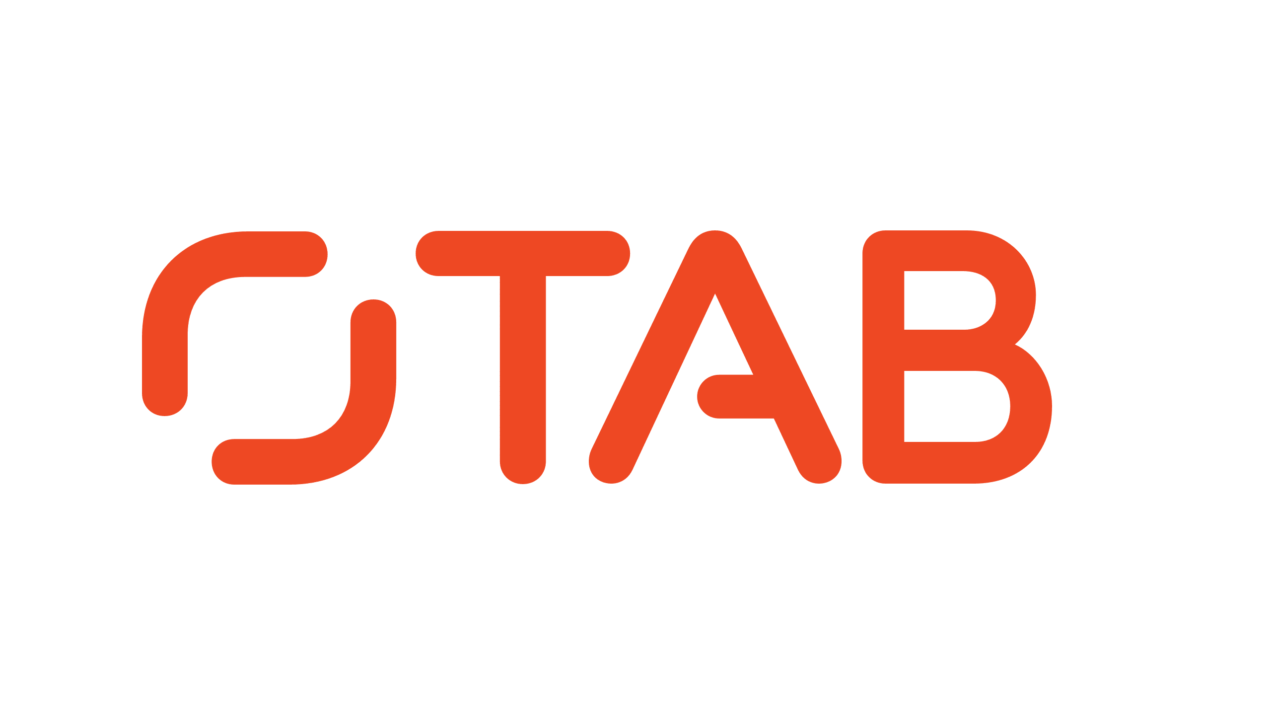
Renamning the logotype from "The App Business" to "TAB". The previous logo was intended as a "seal of excellence" in the form of a stamp. Unfortunately, it was illegible as smaller sizes. With The App Business providing end-to-end services rather than just apps, the name needed changing as well. The new logo is made up of custom lettering, keeping the seal of excellence as a symbol.

Typeface
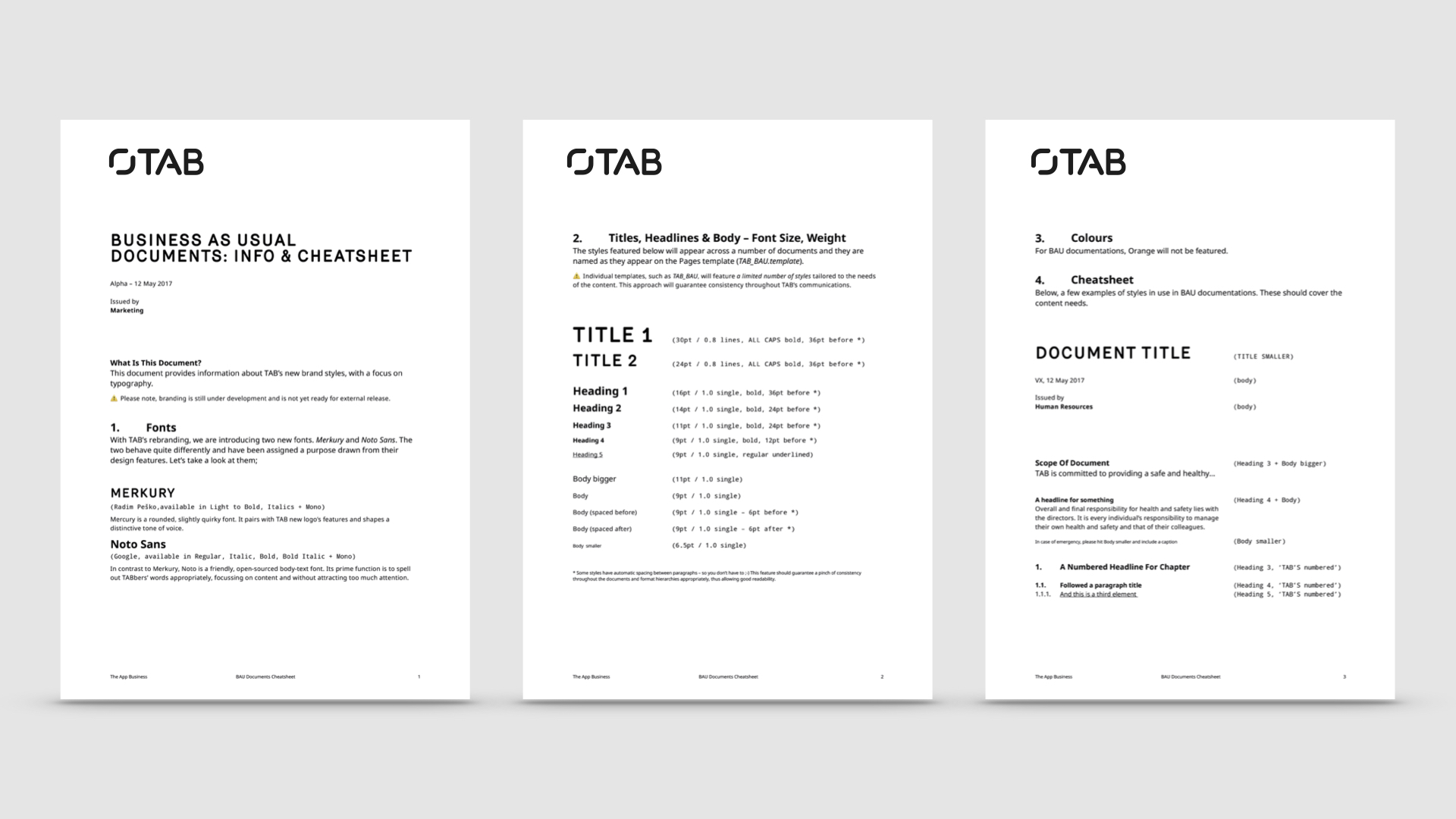
Merkury as title font and Noto Sans as workhorse, replaced Aperçu. Large client contracts and increasingly detailed piches demanded a typography that could be dialled from playful challenger to professional and detailed focused, something that had proven difficult with the previous font.


Applications and templates
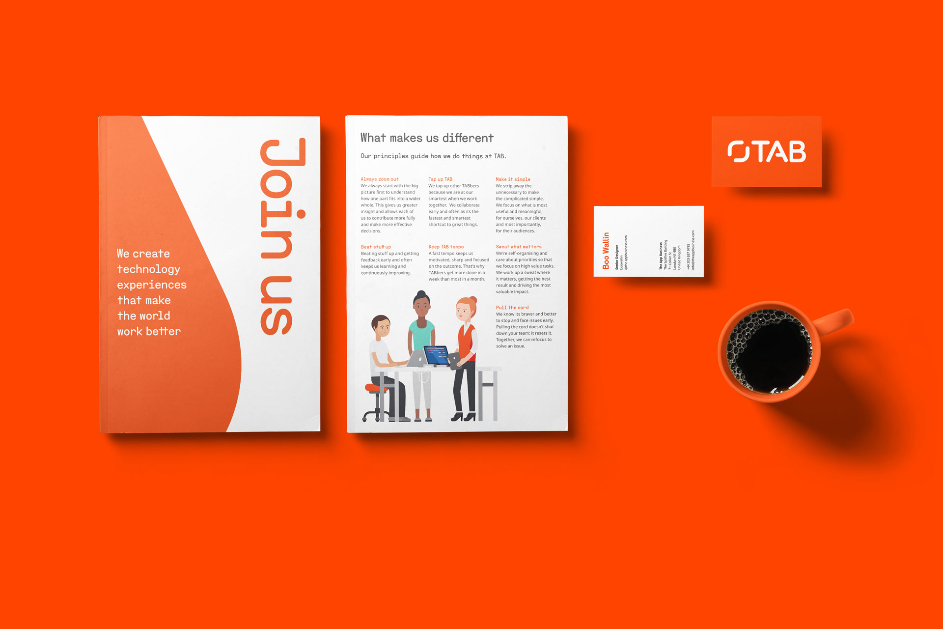
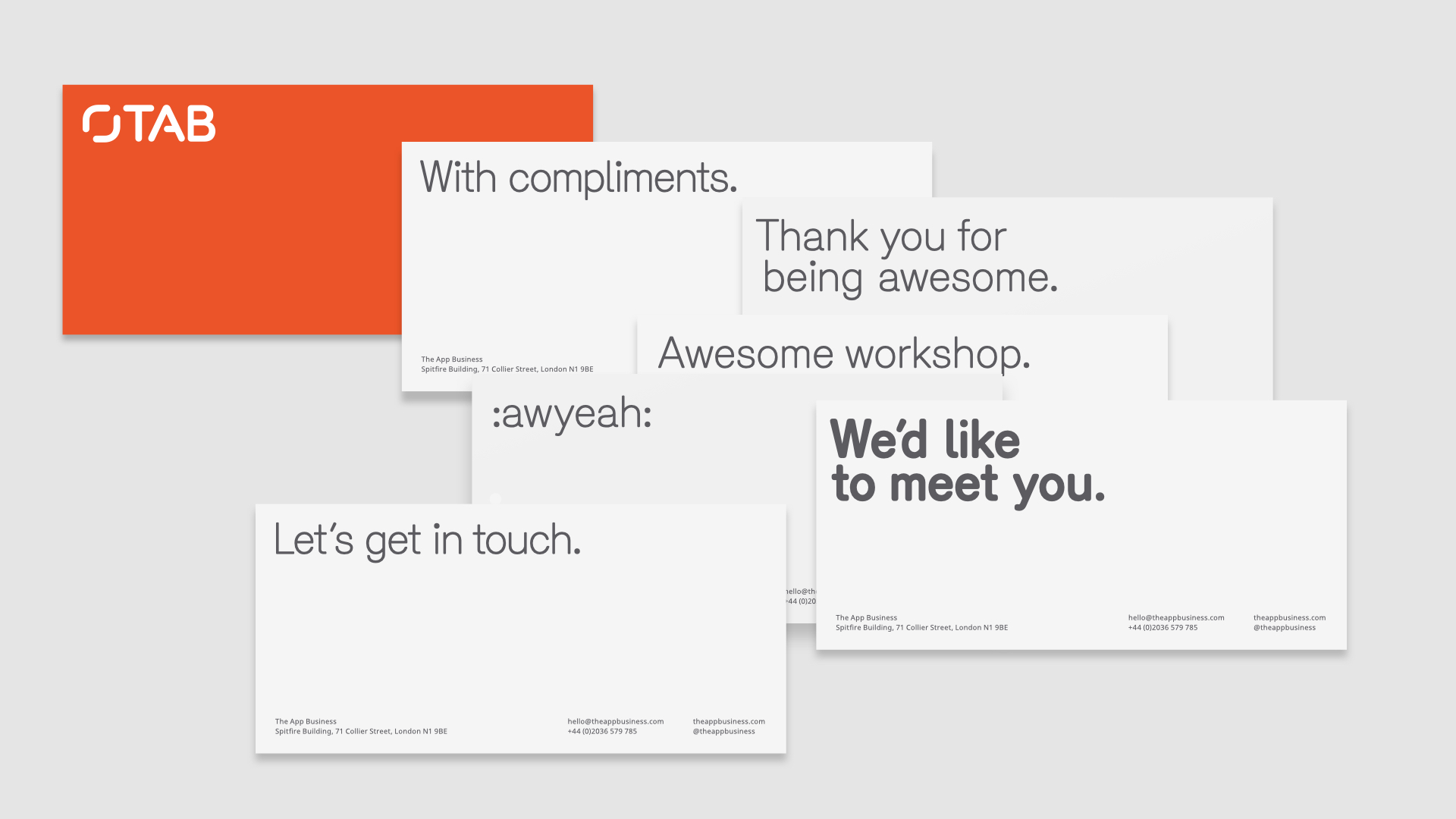
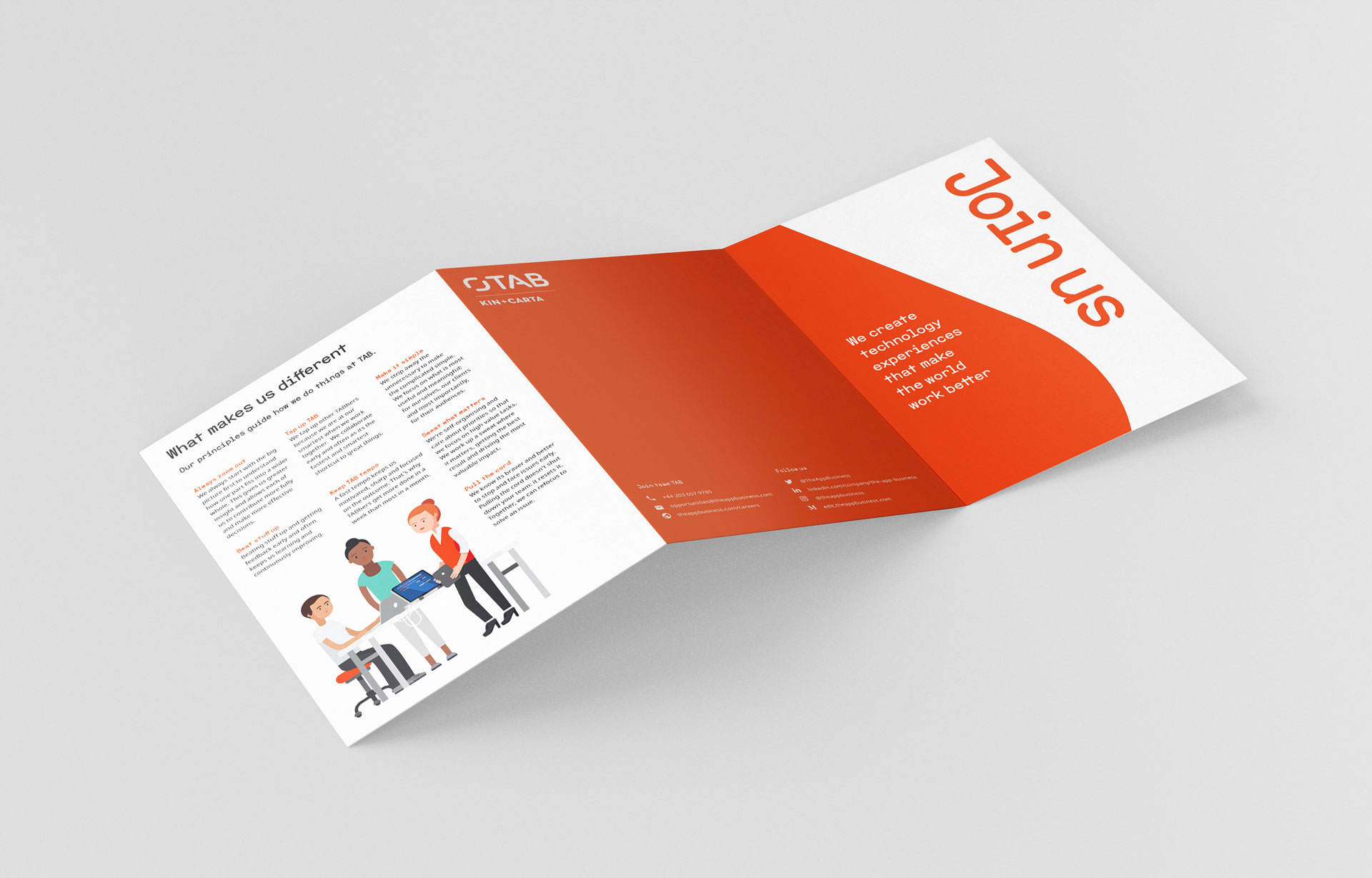
Brand roll-out of Google Docs, Keynote, Office swag and printed matter. Most material was redesigned during the brand roll-out, with the exception from legal letters and BAU docs, which were templated with type styles and instructions.
Publications
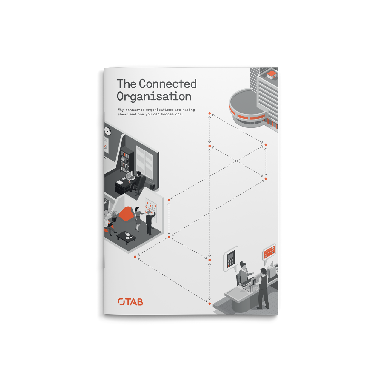
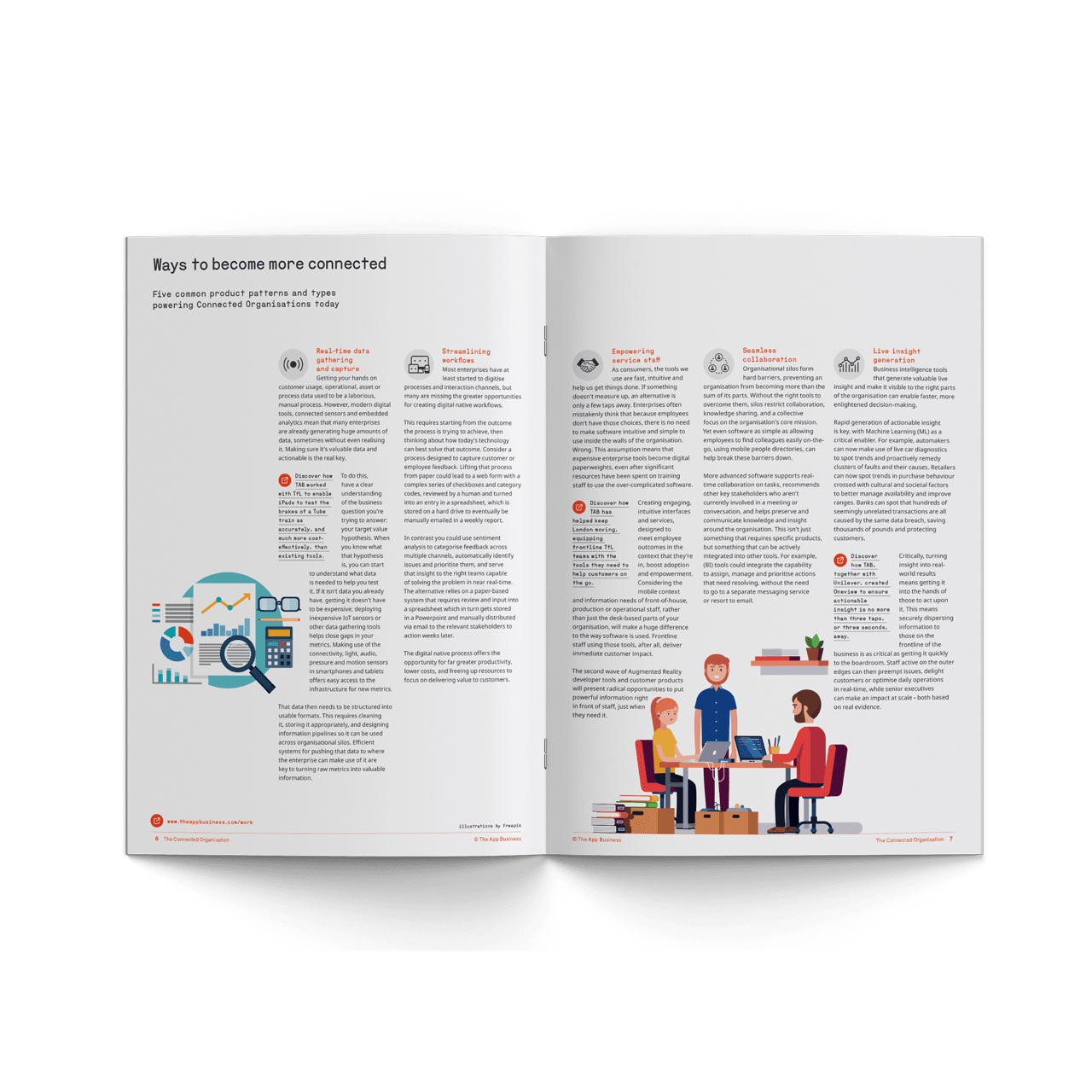
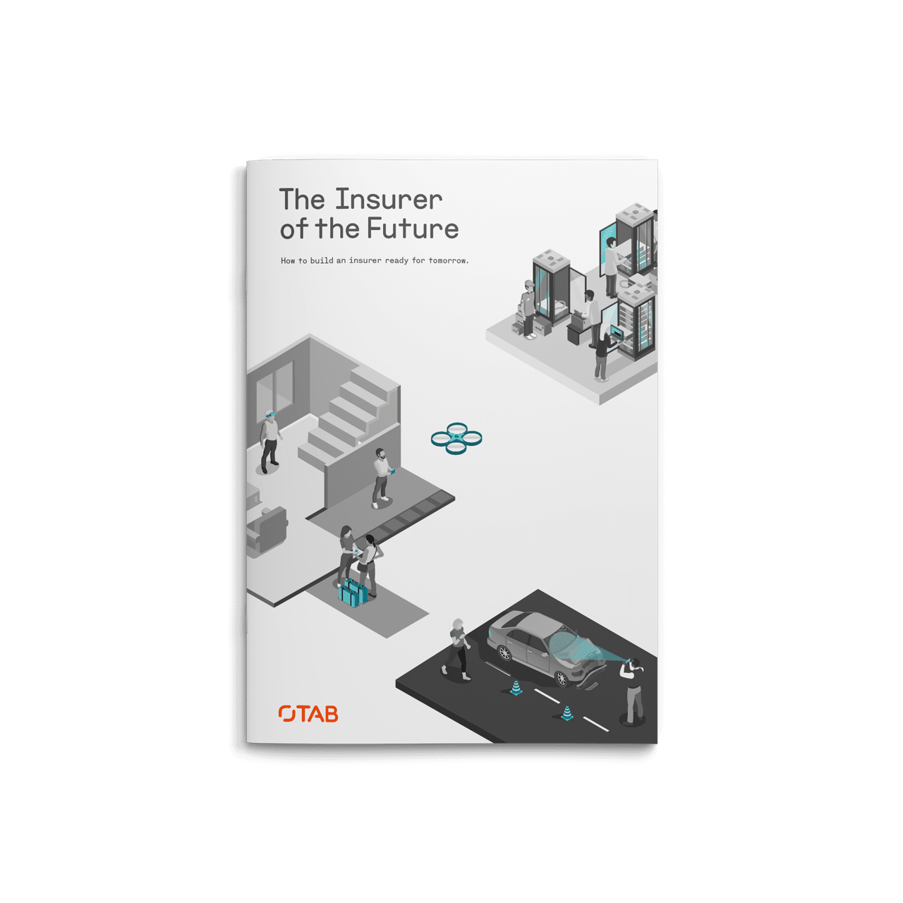
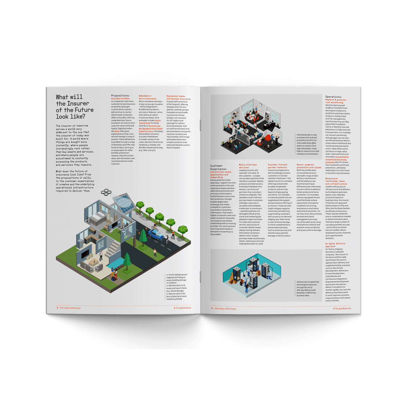
Design and templates for Whitepapers and Case Studies.
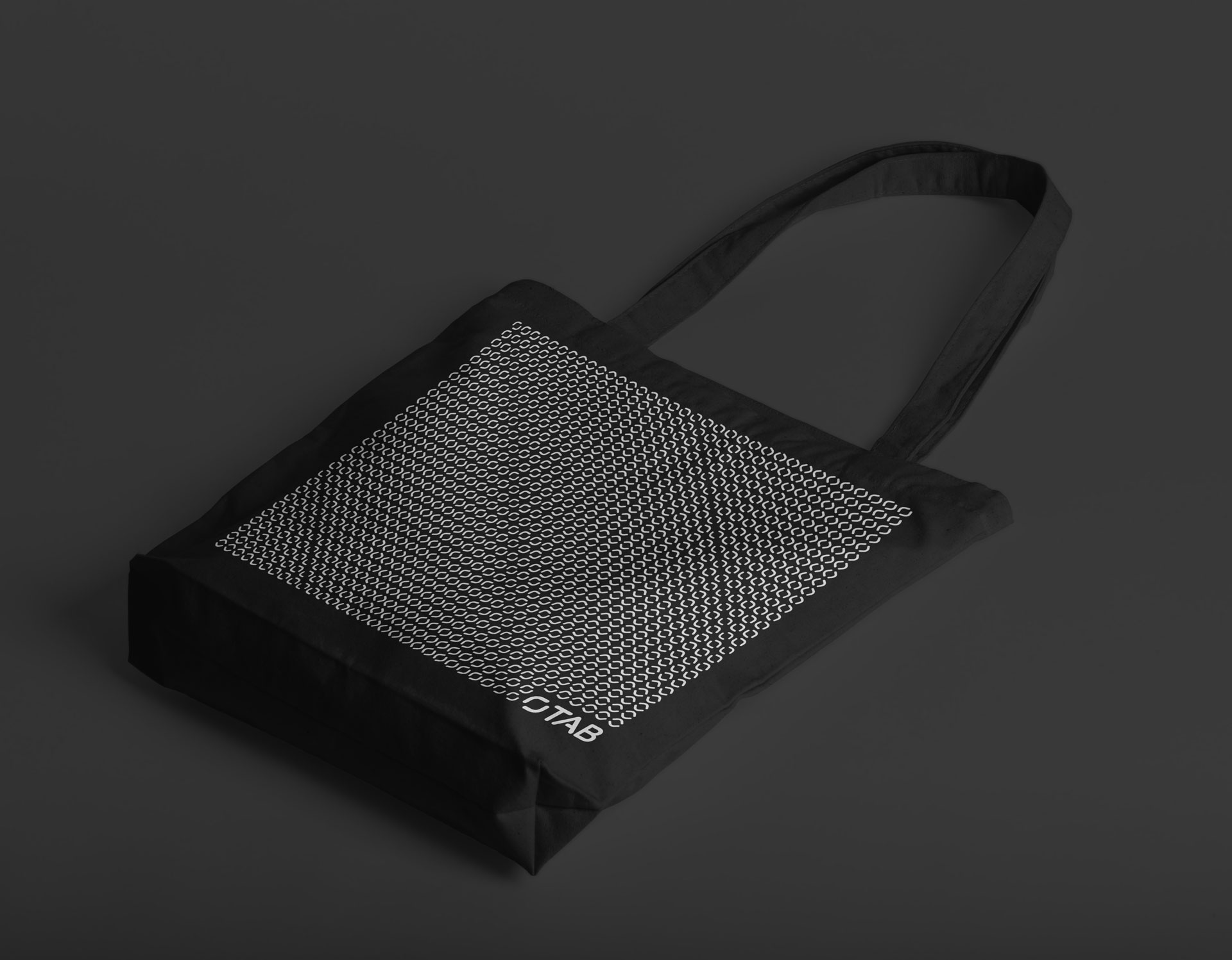
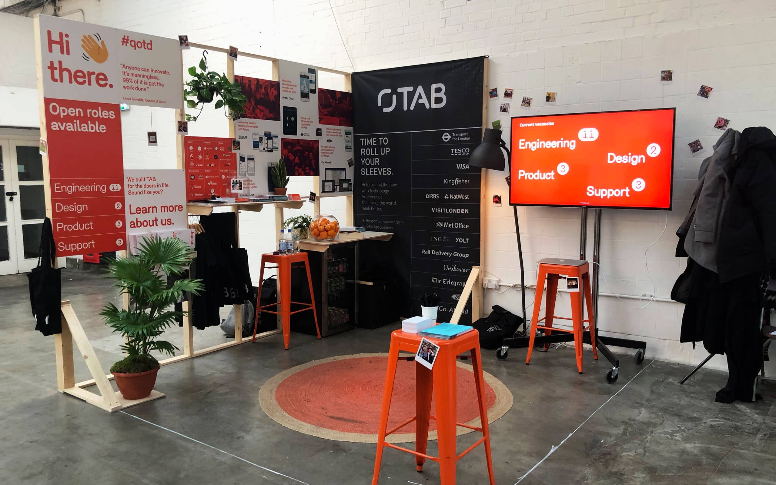
Various applications