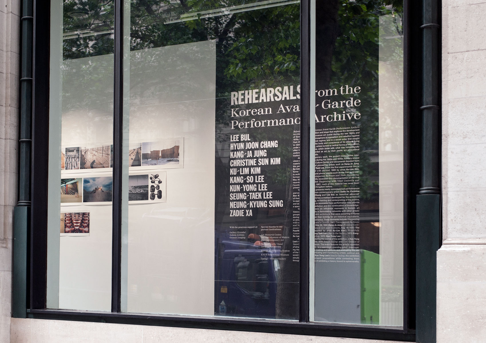
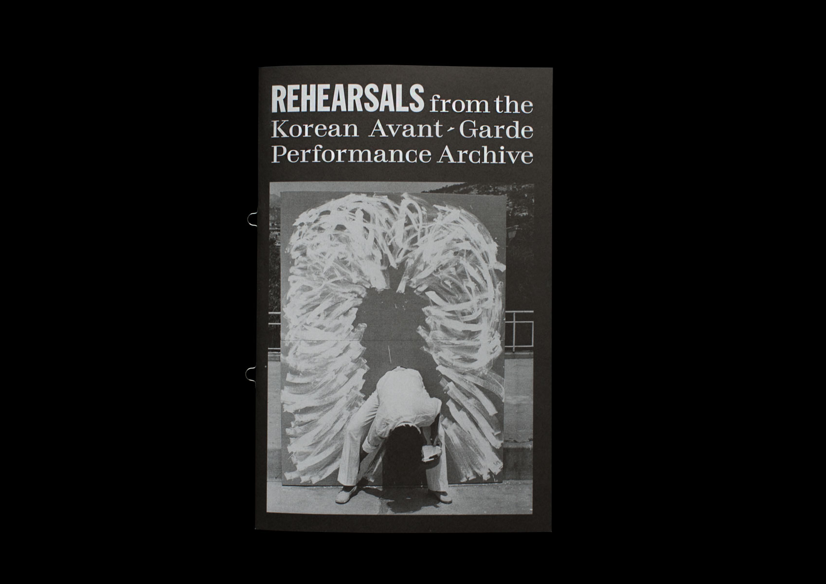
Rehearsals from the Korean Avant-Garde Performance Archive
Project Description
I was commissioned to design a visual identity for the Korean Cultural Centre’s largest art exhibition to date – Rehearsals from the Korean Avant-Garde Performance Archive. The theme of the exhibition was a ‘rehearsal’ of events performed by Korea’s avant-garde during the 1970s dictatorship years. A repressed art scene turned to performance art as a medium of social critique.
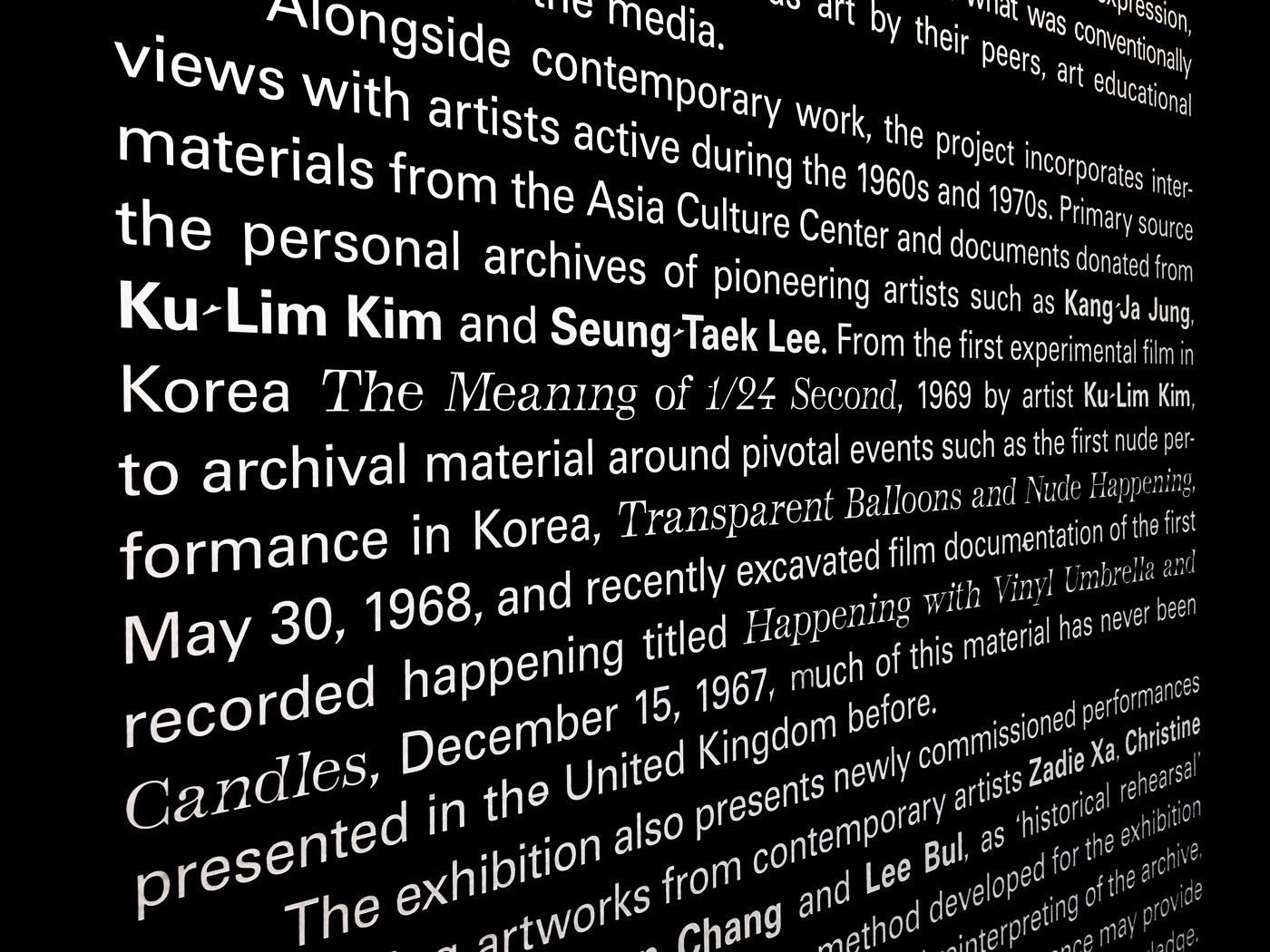
Ash black colours lead the identity of mainly black and white exhibition materials. Typography hinted towards the justified and condensed settings of newspapers – the medium which brought Korea’s performance art to public attention as ‘events’ and ‘happenings’ during the 1970s. To visually hint at the historical and cultural complexity between Korea and the West, punctuation was exchanged/swapped between typefaces.
Credits
Rehearsals from the Korean Avant-Garde Performance Archive
2017
Korean Cultural Centre UK
Visual identity, Promotional material, Interior graphics, Printed matter
London, U.K.
Freelance designer

Exhibition graphics
Punctuation formula
To visualise and emphasise East vs West, punctuation was swapped between typefaces with GREP styles.

Punctuation exhchange matrix:
Franklin Gothic
= TotentanzUnivers 55
= Totentanz
Totentaz
= Universe
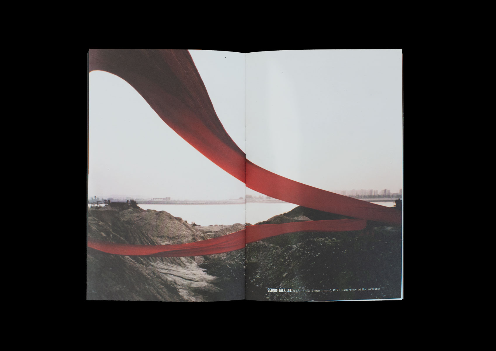
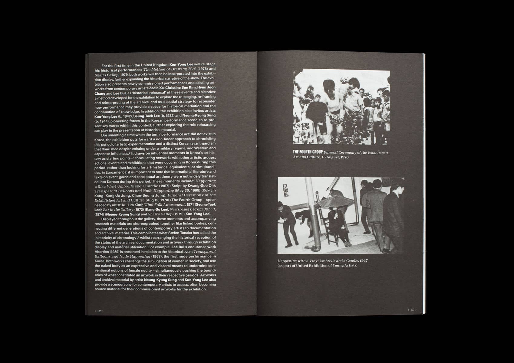
Exhibition guide
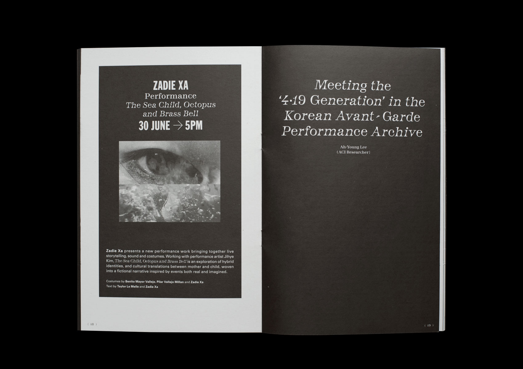
Event invites


