Never Ending Story – Never Ending Logo
Project Description
Never Ending Story is a brand activation agency based in Stockholm, Sweden. They reached out for a logo and core brand tools. The name should have no direct visual connection to the book of the same title "The Never Ending Story", by Michael Ende, nor the film by Wolfgang Petersen (1984). As the connection of names is unavoidable, the first thing I did was to rewatch my favourite film as a boy.
In the story, the world of Fantasia diminishes with the lack of imagination – eventually into only a small grain of sand. It is asked of the protagonist Sebastian Balthazar Bux, to use his imagination to rebuild the world – starting with a name, seeing what is not.
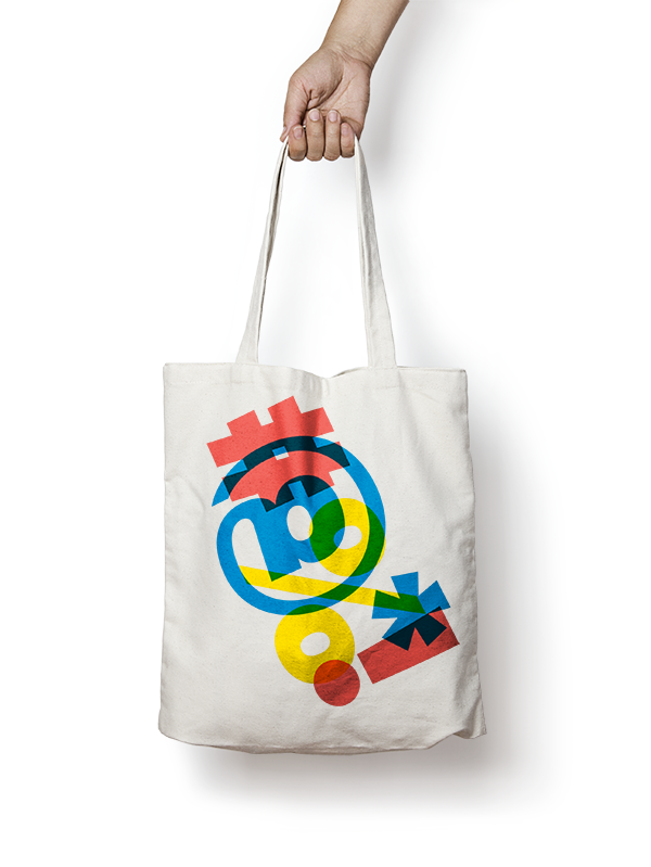
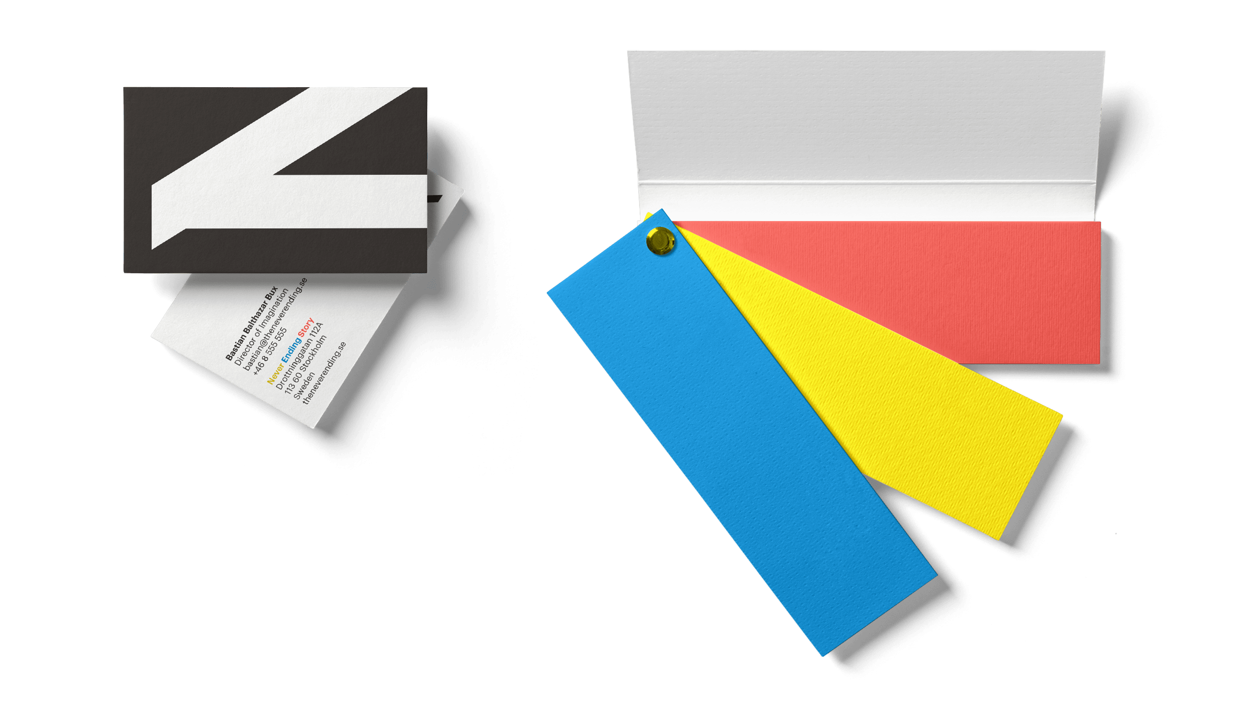
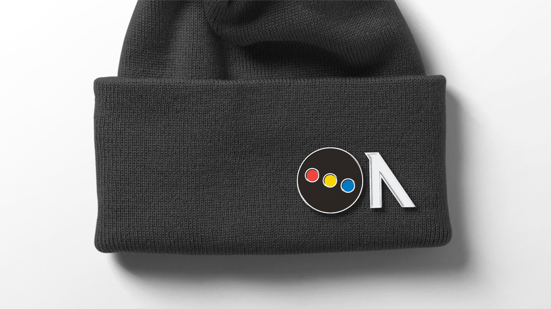
And there it was. I worked on some bespoke lettering and then started to pull it apart. Capital “N” became a symbol for seeing “was is not”, a “never-ending-N”, as Never Ending Story – distilled and visualised into its simplest form.
Credits
- Never Ending Story
- 2016
- Visual identity, Brand identity
- Stockholm, Sweden
- Freelance Designer
Logo development
Typeface
Colour palette

Look & feel


