WIELS Shatter: Bespoke Typecut Reflecting Social Turbulence
Project Description
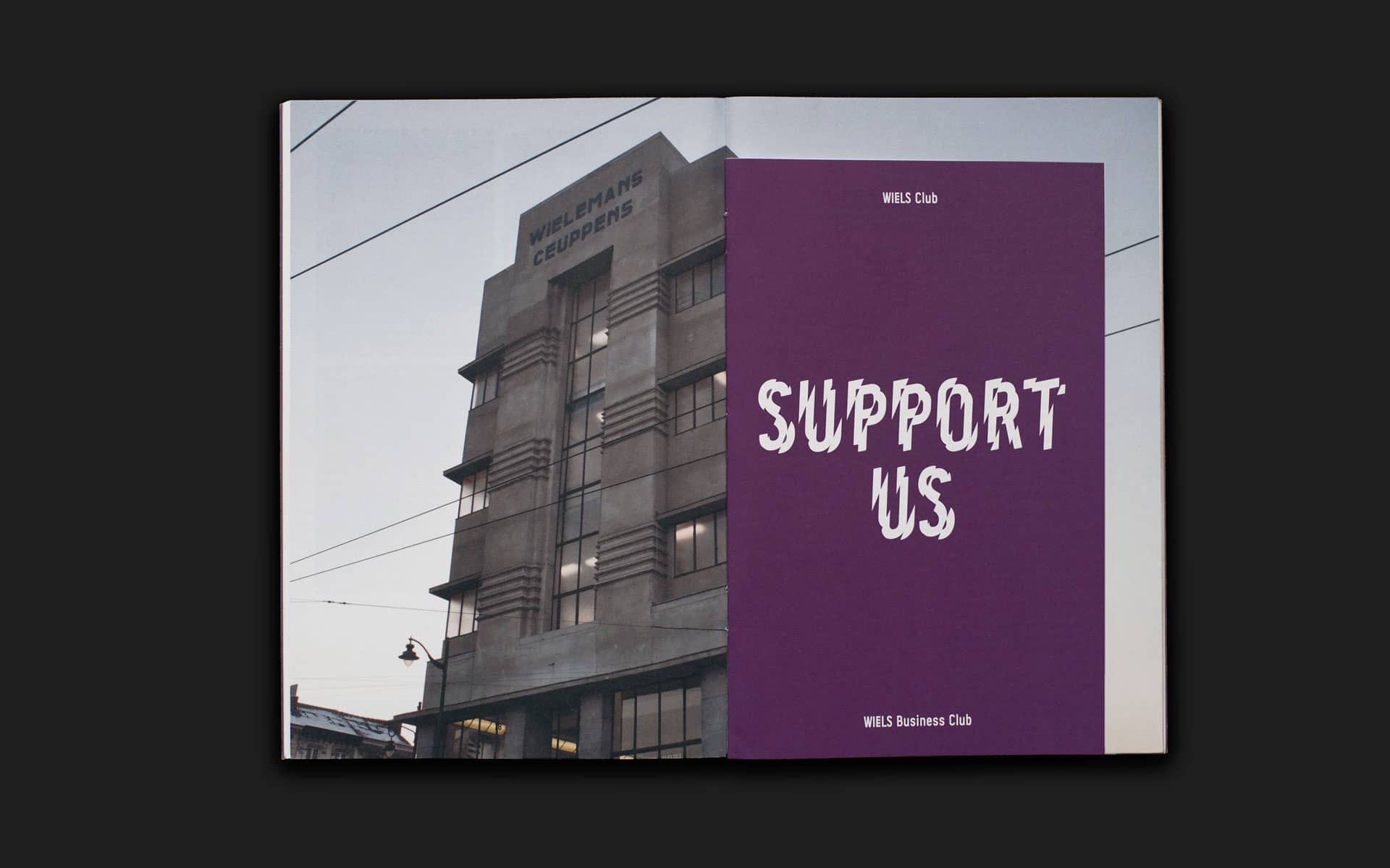
WIELS is a Contemporary Art Centre in Brussels situated in what was previously the "Wielemans tower", an example of modernist industrial architecture in Belgium, built in 1931 for the Wielemans-Ceuppens brewery. Each year WIELS reinvents its bespoke typeface designed by Sara De Bondt and Jo De Baerdemaeker for its new program.
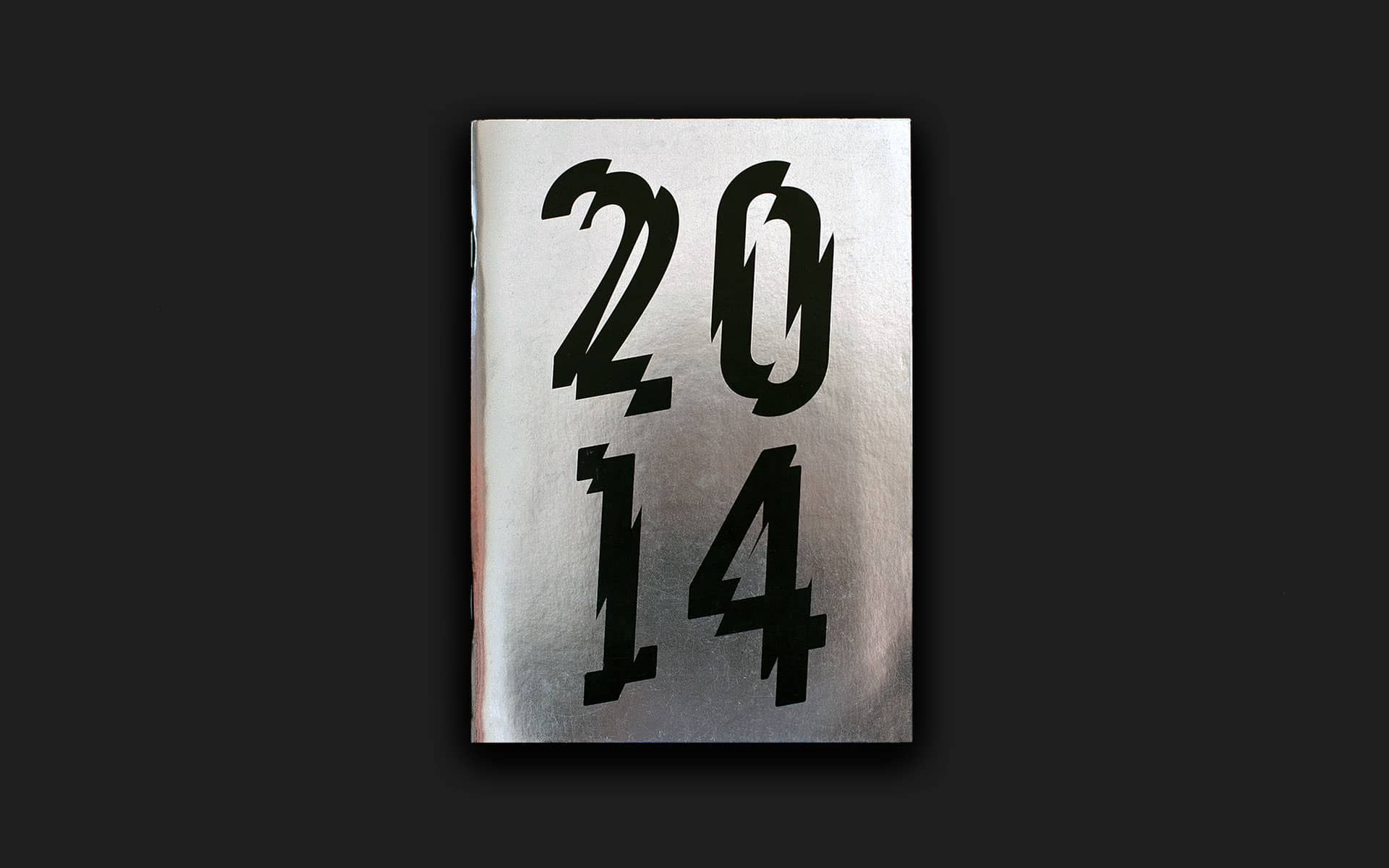
In 2014, I was commissioned to design a version, which led to an exploration of Vic Carless' typeface Shatter. The seemingly straightforward cut-up approach of Shatter proved to be a challenge, as the condensed nature of WIELS typeface needed a rethinking of how letters would be cut and at which angle, to achieve the same look and feel as Careless' work. Design of WIELS 2014 program featuring the type cut.
Credits
- WIELS, type design
- 2014
- WIELS Centre d'Art Contemporain
- Type design, Editorial design
- Sara De Bondt Studio
- Intern/Designer
WIELS Shatter

WIELS 2014
Program for WIELS 2014, where WIELS Shatter is used as a title font throughout.