Voi: Micromobility Accessibly Rebranded

Photography
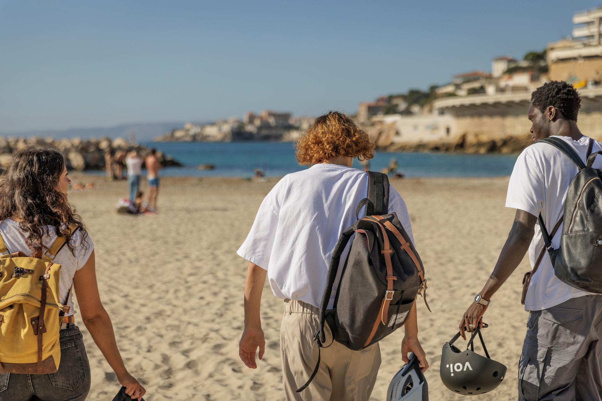
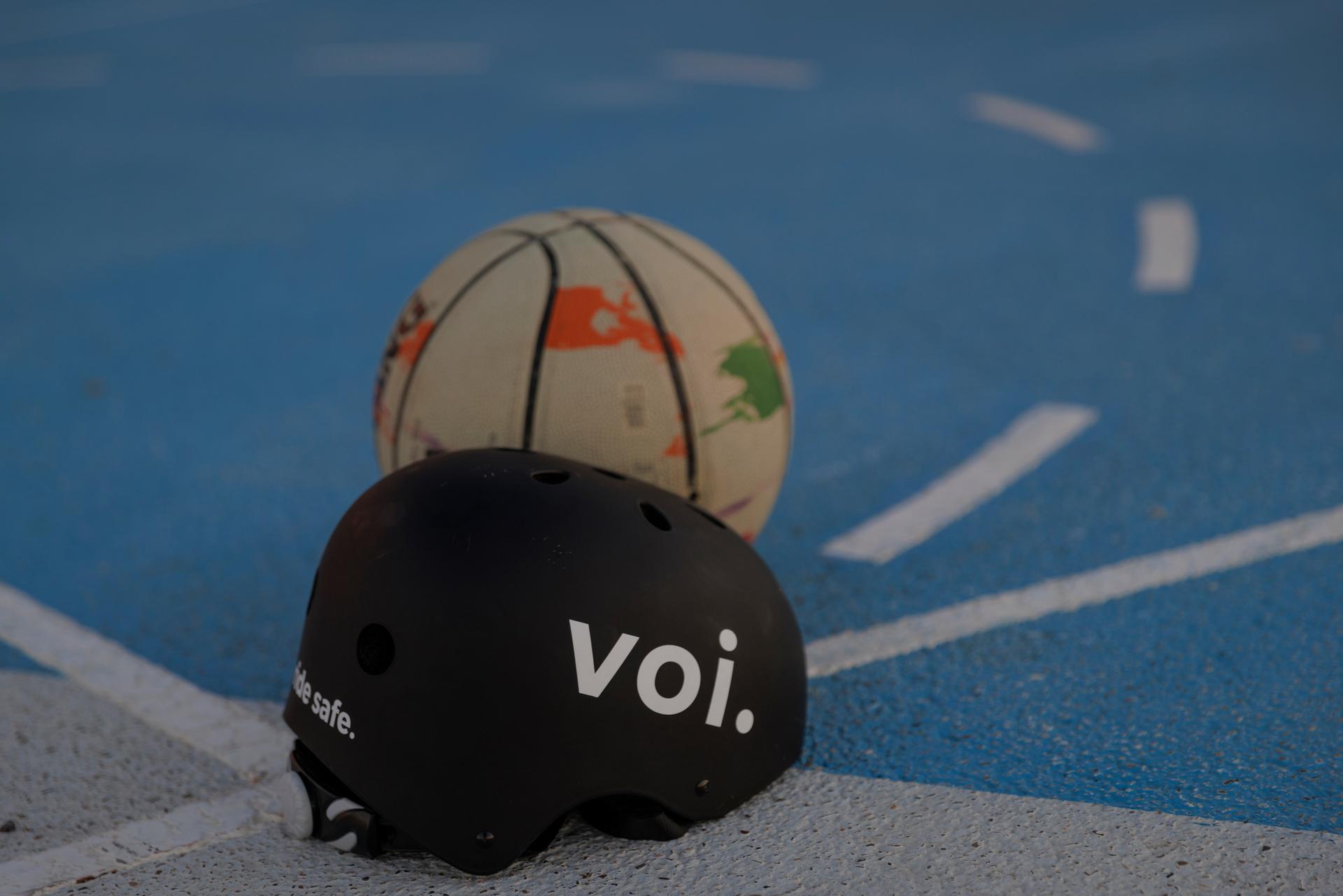
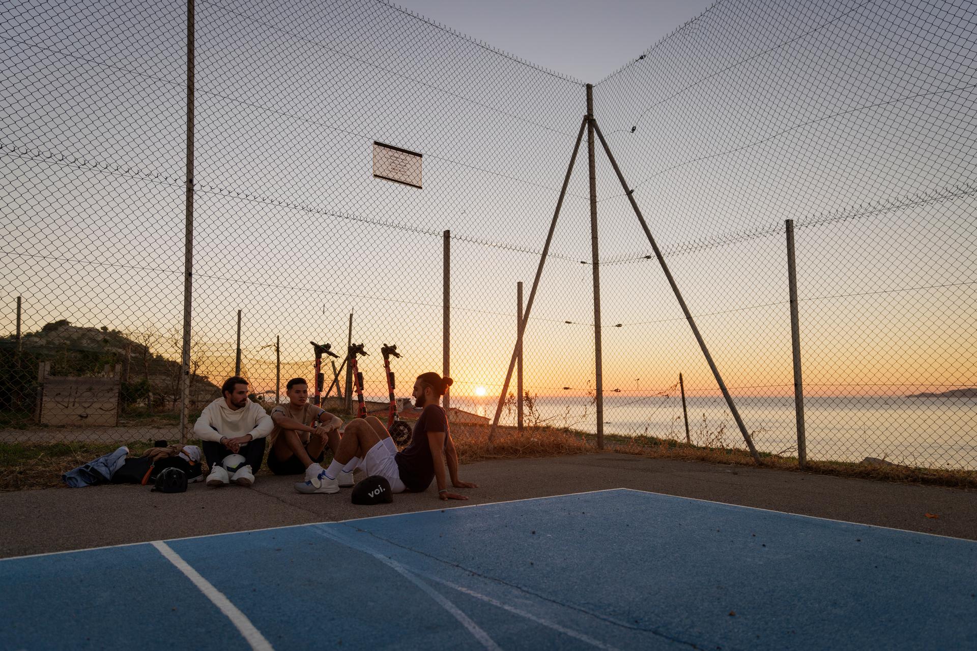
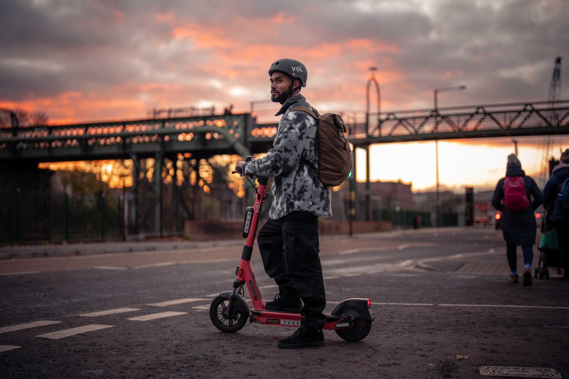
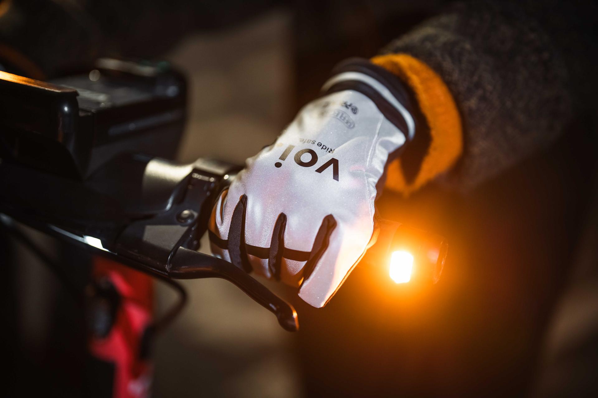
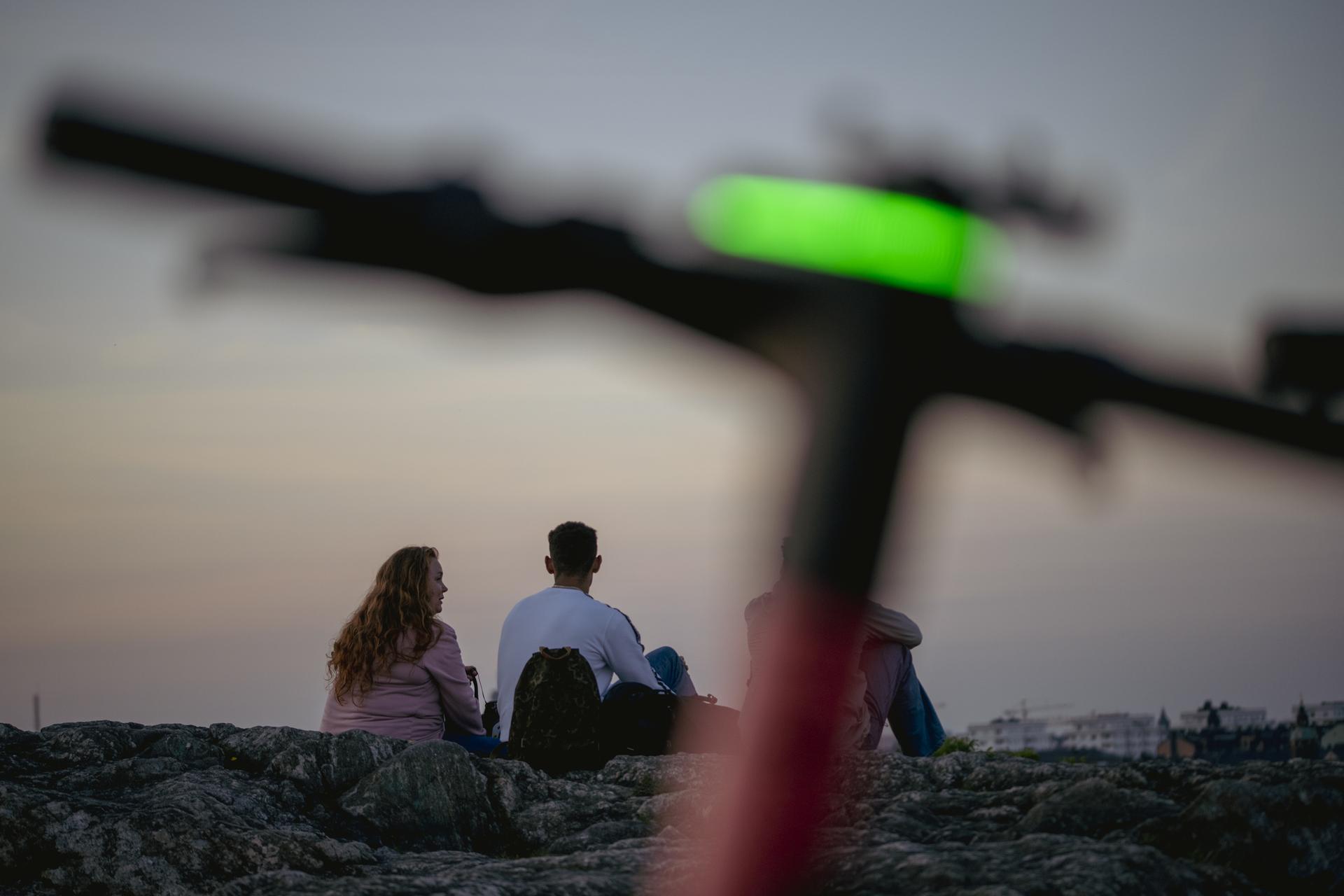
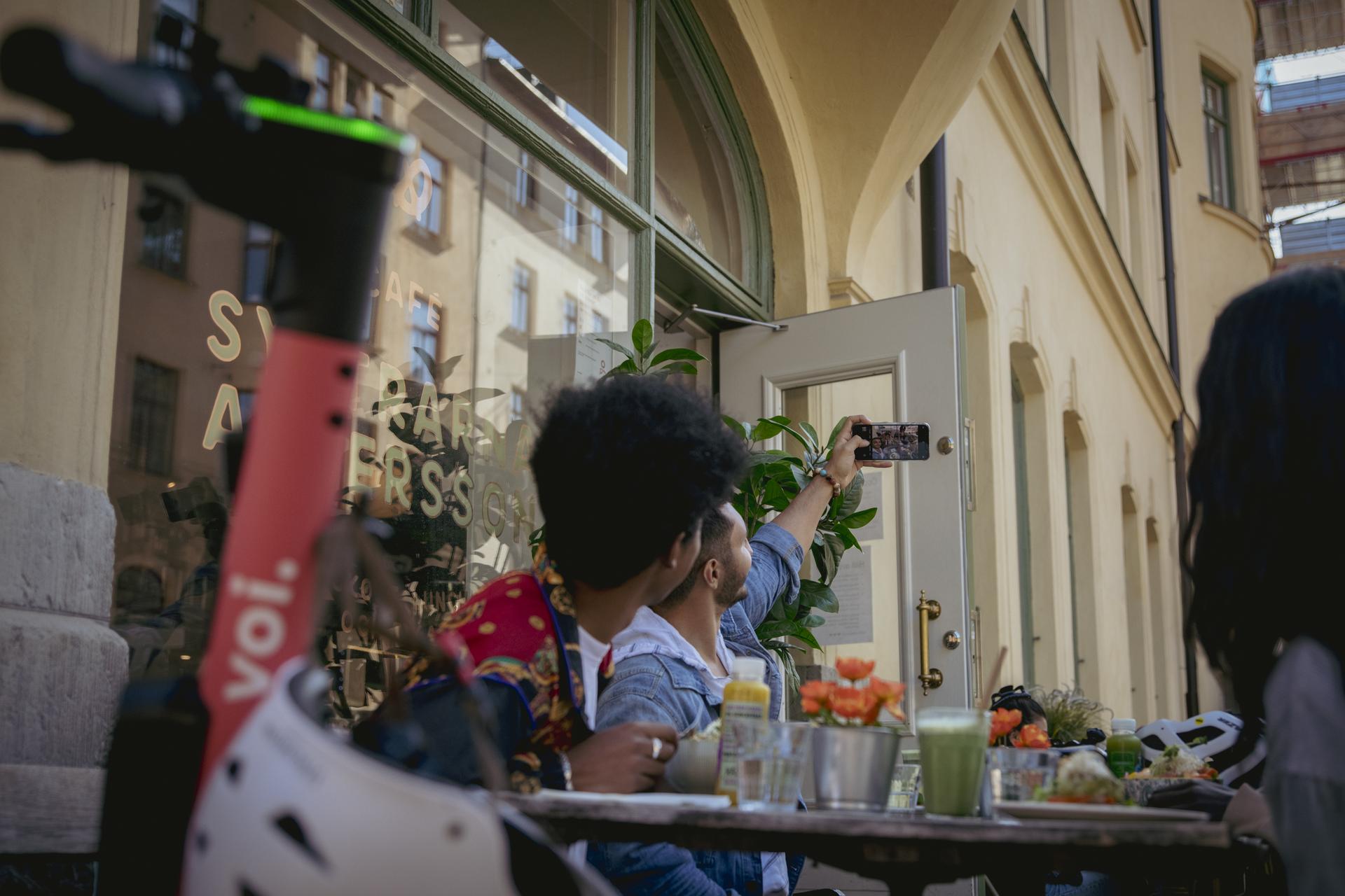
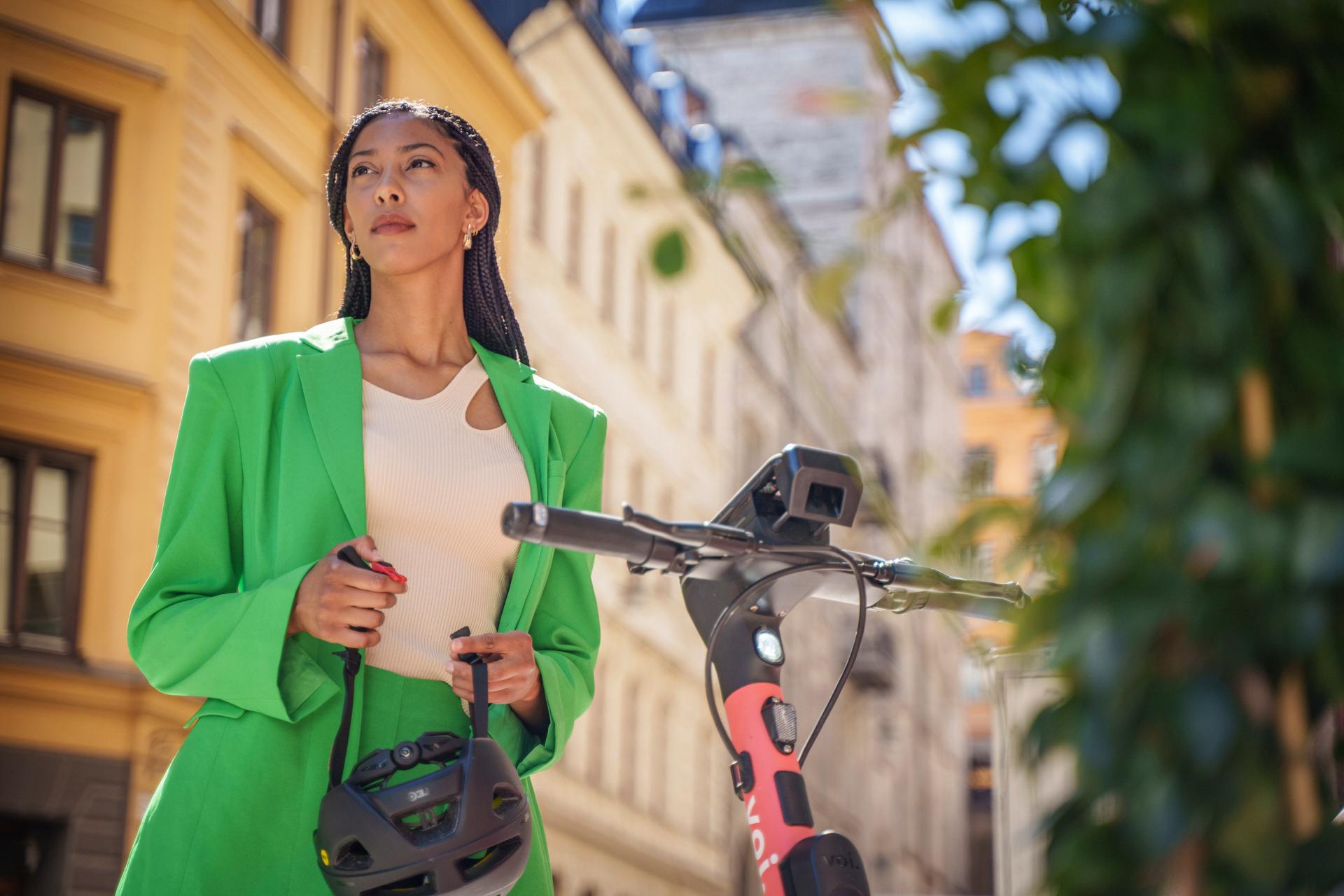
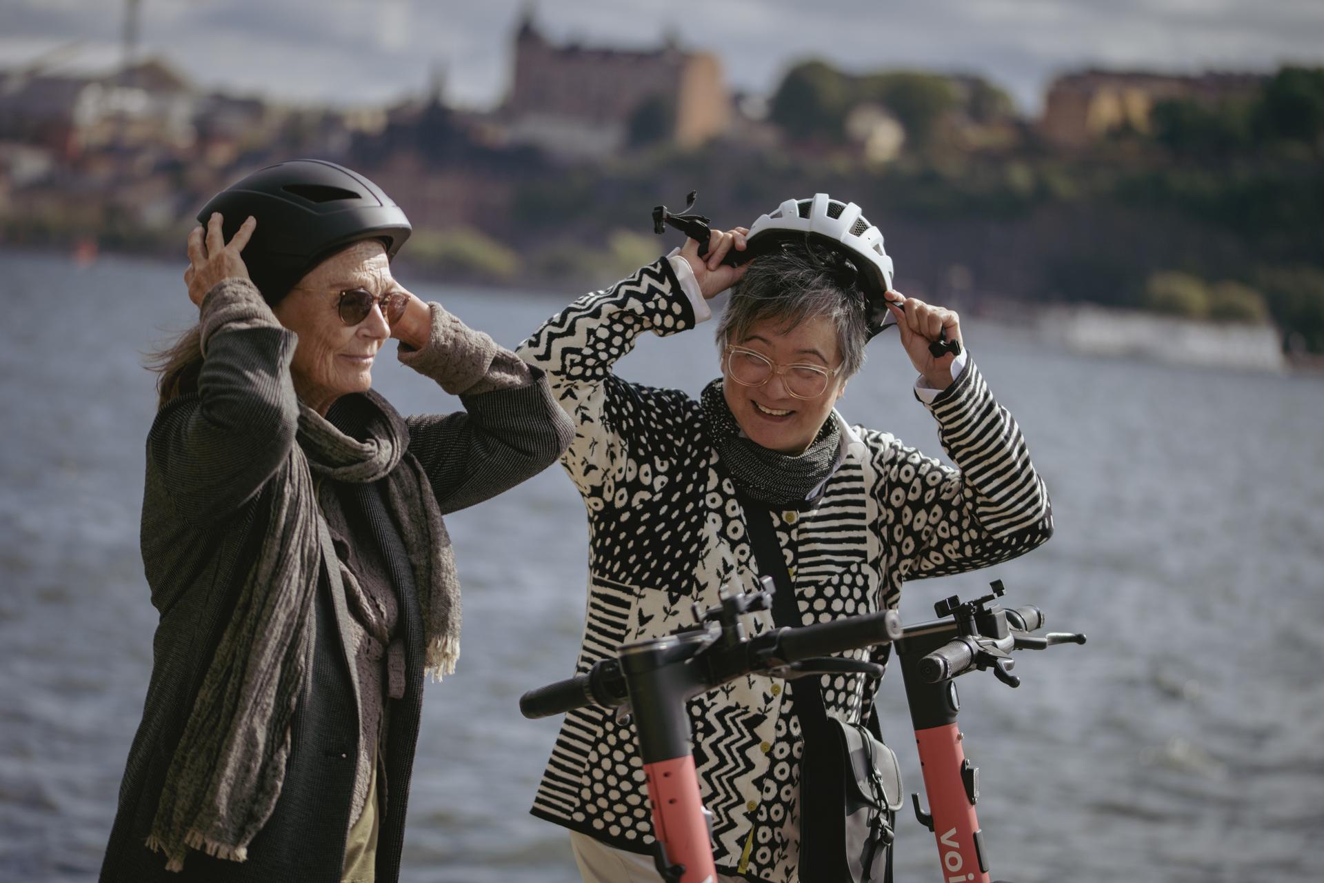
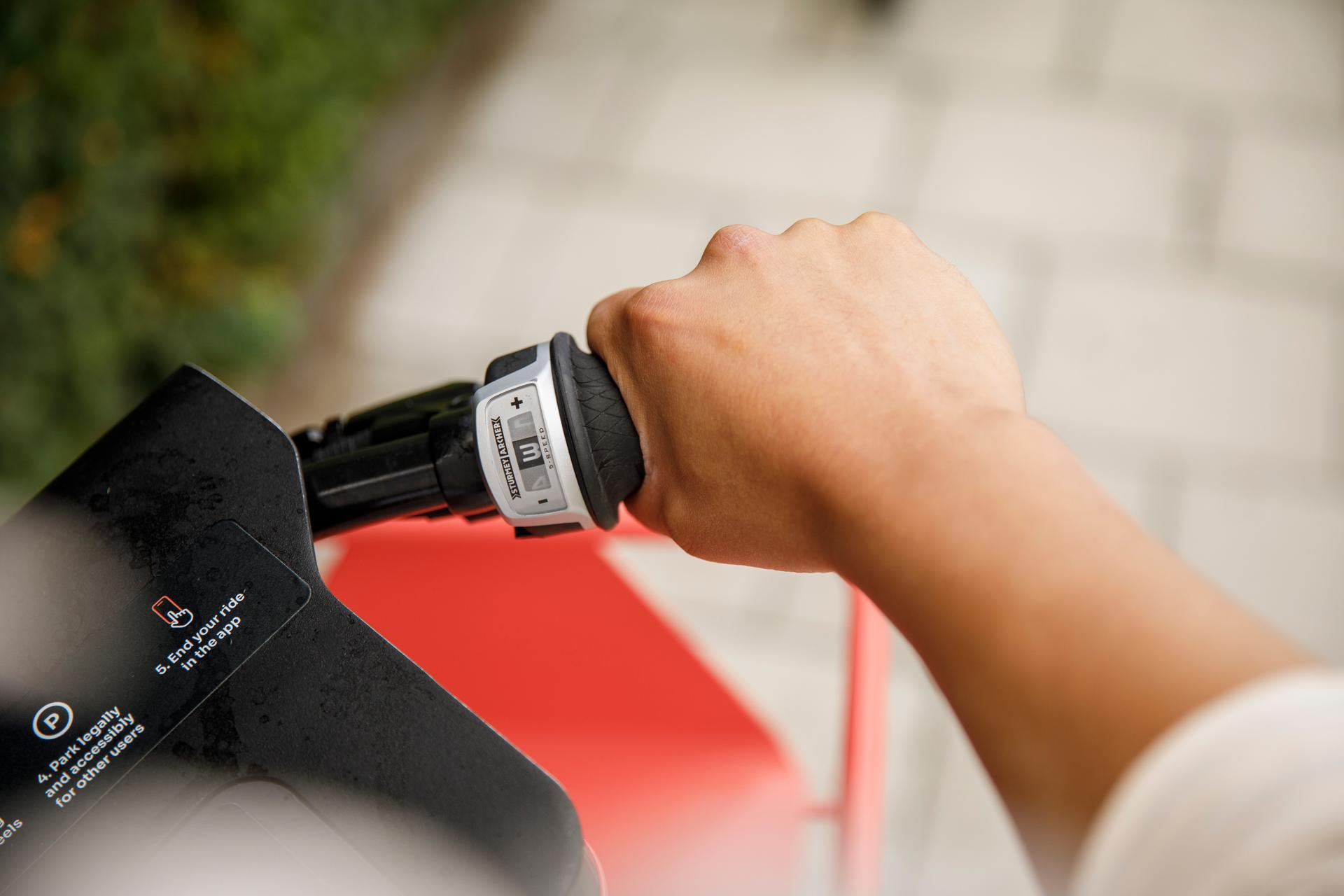
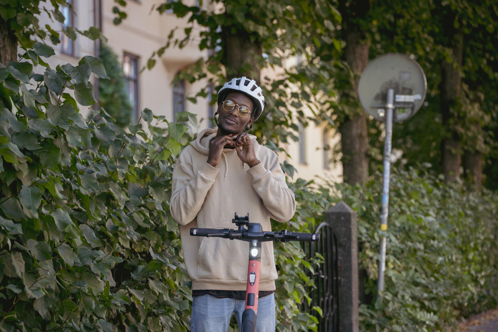
An improvement from staged images to a cinematic, yet journalistic lens – inclusive with product in focus without being overly obvious. A new narrative of micro stories centred around destinations and situations of Voi users with a cohesive and engaging look and feel.
Typography
Voi previously used a typeface which wasn't ownable, nor recognisable as Voi. In search of a new typeface, new requirements had to be considered. Sora, by Jonathan Barnbrook (Google Fonts) met all of our requirements.

Considerations and requirements
Enough character to be recognisable
Accessible and suitable for Voi's needs
Ownable in industry
Humane with a technological feel
Easy to use for non-designers
Affordable for international roll-out
Illustration
Voi's already existing illustration style by Katrin Hauks, were revamped and organised in composition, with a carefully considered file set-up to work seamlessly with the new DAM system's icon library. As a result, illustrations can be composed and localised for the international market – feeling relevant on each location.
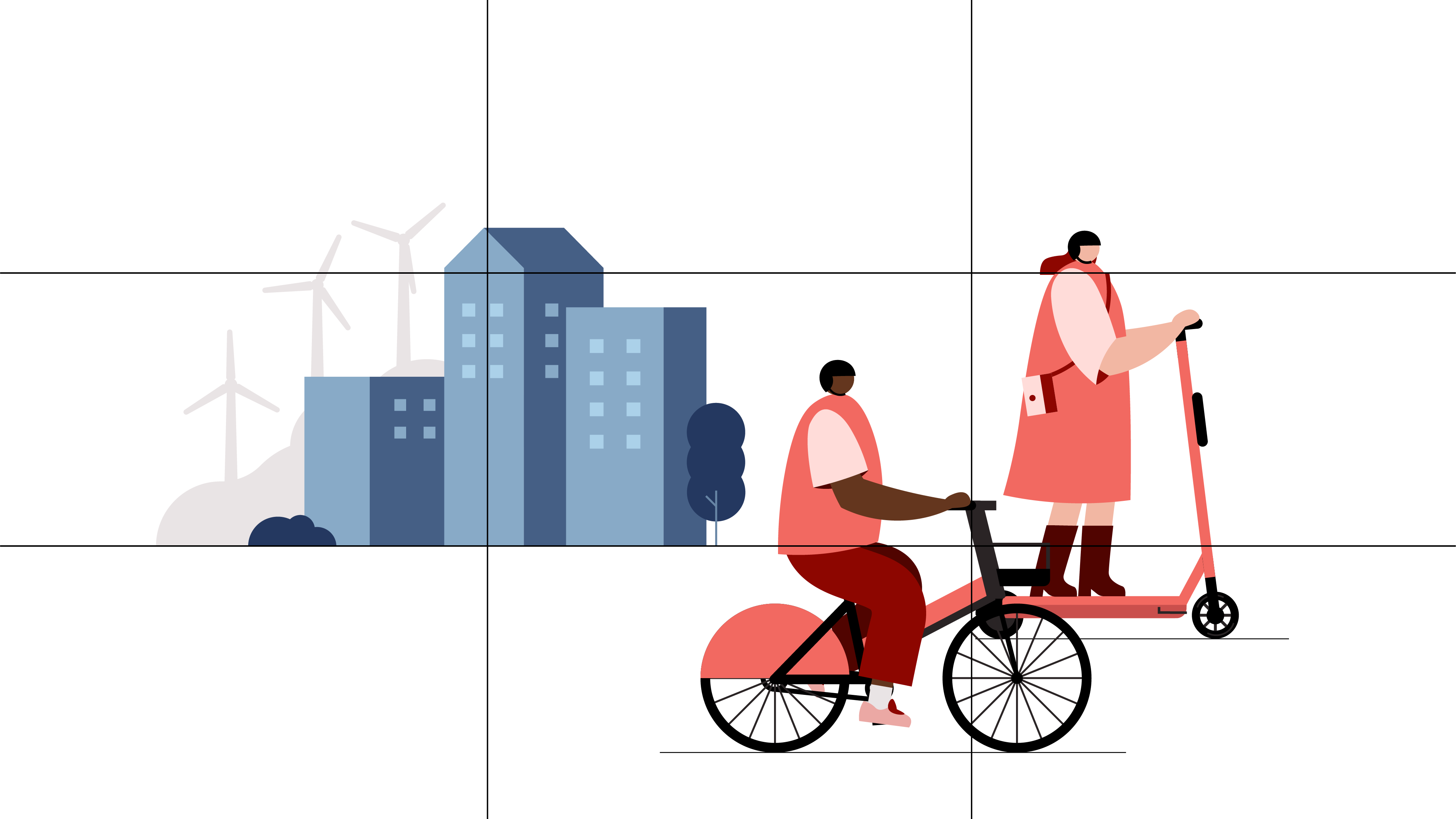
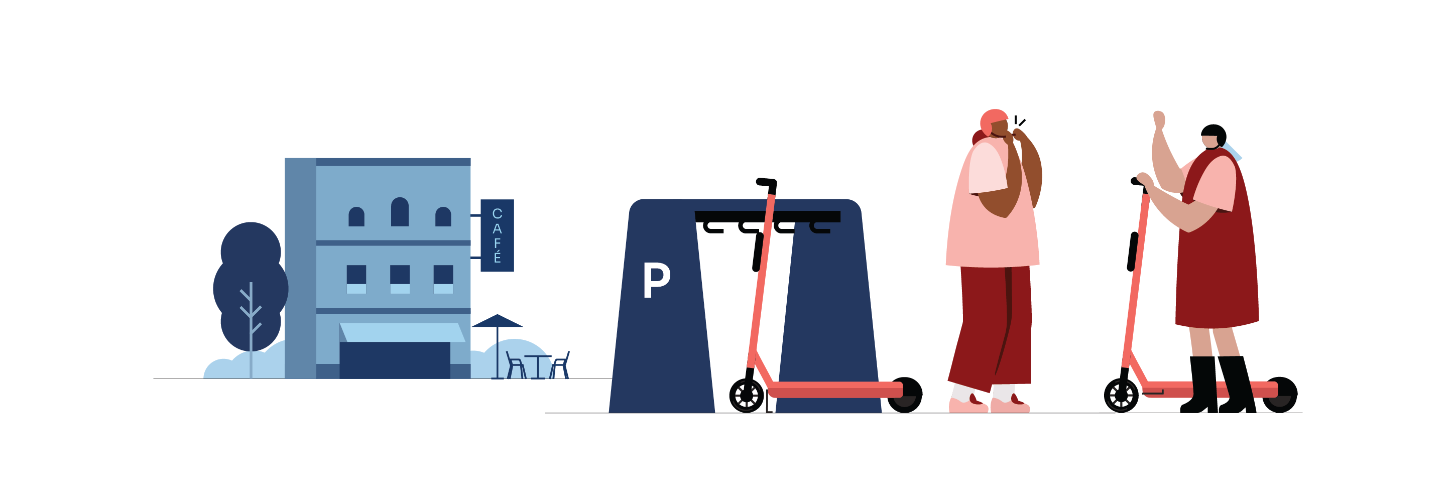
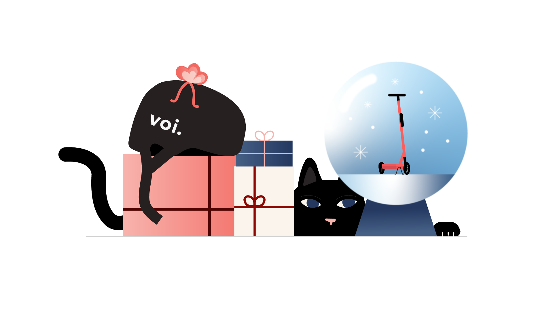
Illustration formula based on three levels of depth and palettes:
Foreground (extended coral)
– Main messageBackground (extended blue)
– ContextualDistance (extended grey)
– Geographic
* Illustrations by Katrin Hauks
Iconography
Icons in the Voi app doesn't change often and when they do, they are given a lot of love. The scope hence turned towards everyday powerusers in pitches and presentations, where prominent factors of cohesive style and an extensive library became focus.
Colour themes
Voi colour palette needed to be revisited and structured to meet AA a11y standards. Voi coral needed to be slightly altered without being noticable. Main colour themes with specified purposes were created to guide the overall balancing of the palette. Coral theme for e.g. brand recognition, Light theme for web and other neutral environments, and a Dark Theme for moving image, and photography-heavy compositions.

Extended palette
Illustration as well as data visualisation demanded an extended palette with inherent contrast requirements. To retain this control and limit misuse, each colour range was limited to five shades.

Data visualisation
The new extended palette is also designed for data visulisation and innate contrast requirements. Guides to charts and when-and-how to use them were also part of the task, as well as a range of other application examples.

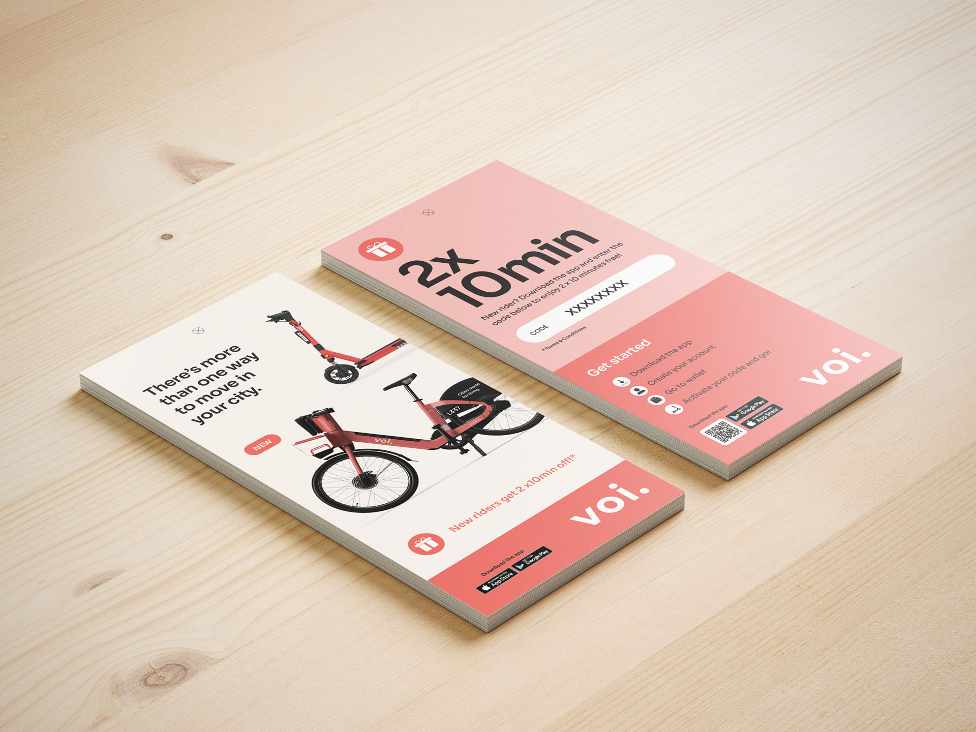
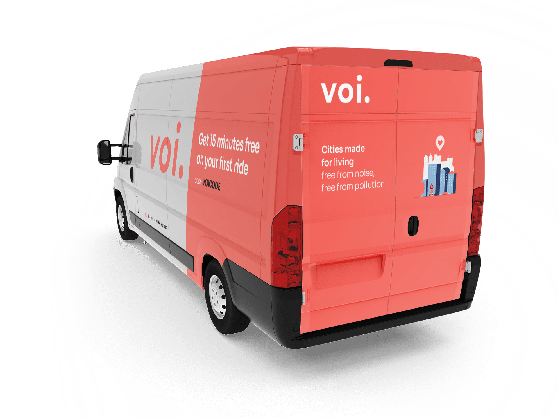
Campaigns
Leading all international campaigns for digital, social and OOH. General considerations were localisation and translation into several European languages, animation and a need for brand recognition. A great opportunity to apply the new visual identity and see it come alive.

Let's get it right
Design of graphic profile for the award winning campaign "Let's get it right" (Svenska Design Priset 2022 – Gold, Film/animation,Techology/Services)
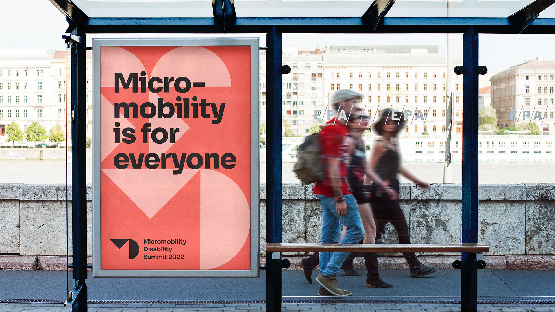
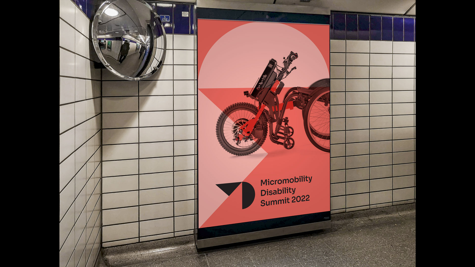
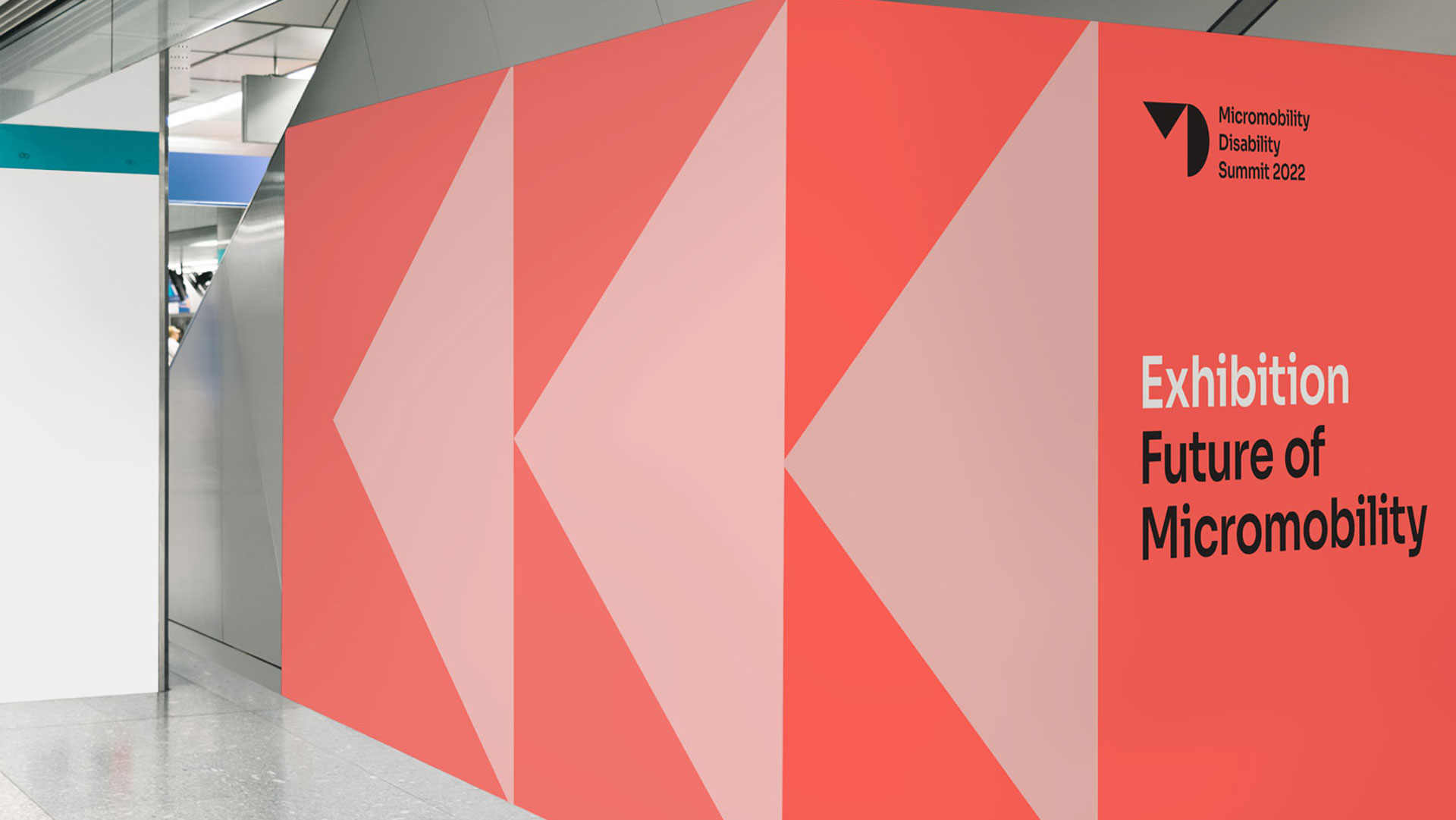
Events
Design for Micromobility Disability Summit 22. The logo acts as a vessel for composition and graphic treatments.
Templates
Design and testing of a wide range of templates and application guidelines for our DAM system, all based on messaging hierarchies, ease of customisation, usability testing, and costs.
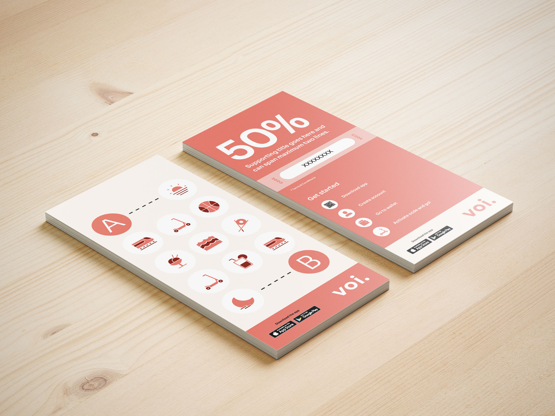
All templates are accessible via the DAM system and can be edited where necessary, and downloaded through an approval system. In this example, hangtags are editable for localisation purposes.